New style guide for Royal Papworth Hospital
A new name, a brand new hospital and a 100th Anniversay – it's all change at Royal Papworth Hospital in 2018. To mark all these changes the Trust has a new corporate design style – a fresh new look for all its communications.
Media Studio has worked with Papworth's Head of Communications, Kate Waters, to develop a comprehensive Corporate Style Manual. This is an essential element to the launch of new corporate branding and sets out precisely how to use all the elements of design in different documents and other media.

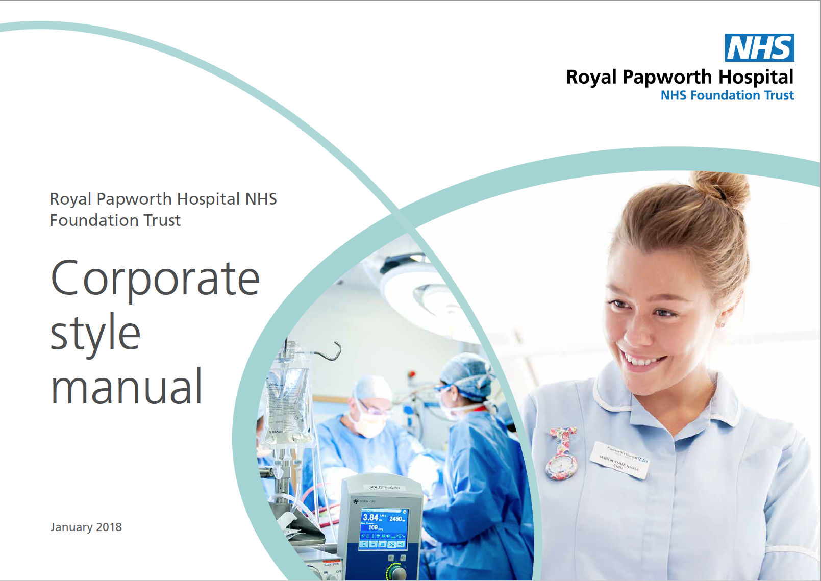
The Papworth curves have already become familiar to staff and the public, reflecting the organic shapes of heart and lungs as well as the ovoid shape of the ultra-modern new hospital building on the Cambridge Biomedical Campus.

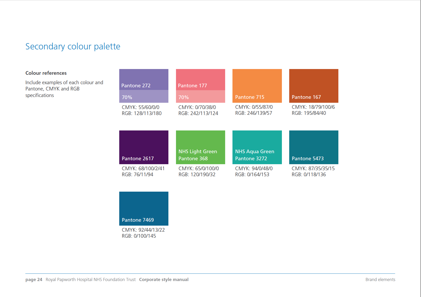
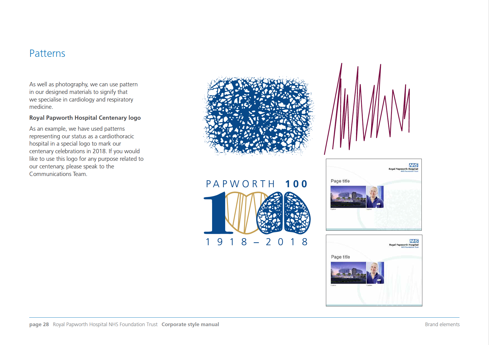
The challenge was to produce a distinctive style while adhering to the national style guidance for the NHS. Fonts, colours, logos, photographic and illustration styles are all defined here, with examples. This 37-page guide makes it easy to comply with a set of well-thought-out criteria for all future Trust communications.

